


This print began it's story on the 10th January when I saw these rocks for the first time. I went back a few times scrambling up and down the banking to get the photo i wanted with the right composition.
I worked out my size and plan as a pencil drawing.

Then flipped it and transferred it onto the lino.

First cut - everything I want to keep white, which was the birds on the rocks and some white foam on the sea. I printed a very pale blue.

next I cut out water detail and printed a second pale blue.

more sea cutting

and another blue printed

It was looking like a foot print and I was really hoping I hadn't messed up with the composition. I hoped by the time I'd finished it wouldn't.
After cutting lots more sea ready for the darkest blue, I was ready to start printing my first rock colour.
At this point I wasn't happy with the colours on my photo.
The photo above was great for detail but I thought it was too pink. I didn't feel confident about making the colours up so I decided I'd better go back down and get a new photo. I much prefer this one as a colour ref.

I printed my palest first rock colour, you can begin to see the birds.

Next I had a bit of a puzzle, as there is no gap between the rocks and the sea in the top of the lino. The colours were going to be a pretty close in strength so I didnt want them overlapping.

I decided on using a stencil to cover the rocks and printed the sea. The stencil looked good just on it's own.

4 blues in the sea.

The sea finished, I could cut it all away and concentrate on the rocks.


the last colour was black and then I printed the grass in green and brown
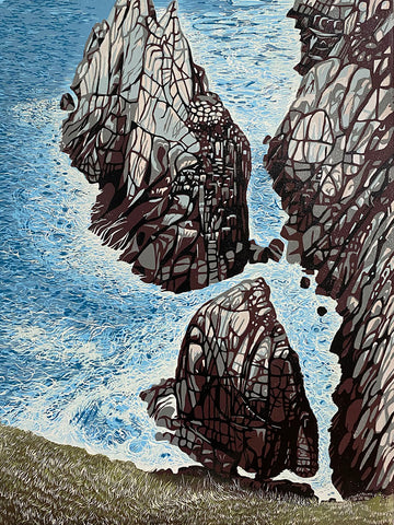
Finished and numbers 2,3,5 & 6 are all similar.
Of course I did a little playing along the way so I have quite a few varients.
I tried a much more dramatic version, more black less detail. More contrast between the light and dark.
No.10 is the strongest contrast

with 1 and 9 I added some green to the rocks

No.8 I printed a light grey as the last colour instead of black as I'd already used black in the last layer on this one.

I've put a few up on my site here